
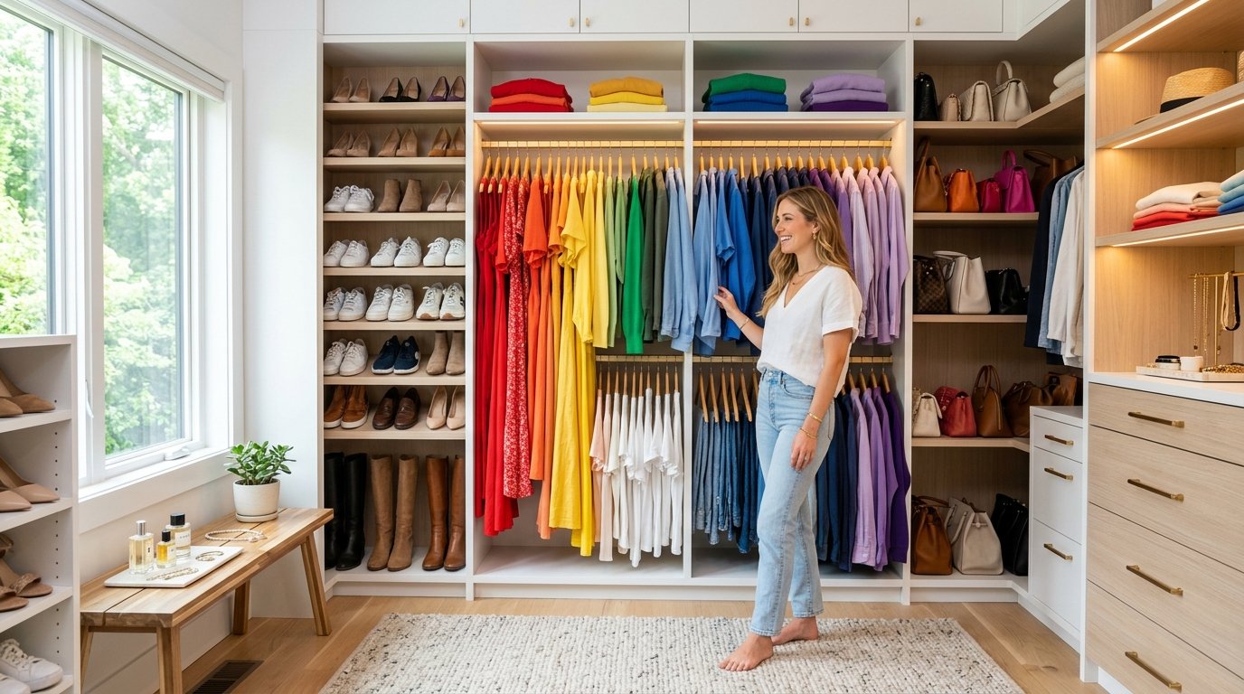
Have you ever stared blindly into a completely packed closet and felt utterly overwhelmed by the chaotic visual noise? Visual thinkers process daily information through vivid spatial relationships and distinct patterns rather than rigid logic. This makes getting dressed extremely exhausting when your clothes lack a clear visual structure. I have helped dozens of frustrated clients reclaim their mornings using strategic wardrobe organization by color techniques.
You desperately need a dedicated system that intuitively speaks your unique visual language every single day. Transforming your messy space into a breathtakingly beautiful spectrum completely eliminates daily decision fatigue. When you arrange garments intentionally, your brain instantly recognizes exactly where everything belongs without active thinking. Let me show you how these specific styling methods can turn your stressful morning routine into a profoundly peaceful experience.
Executive Summary
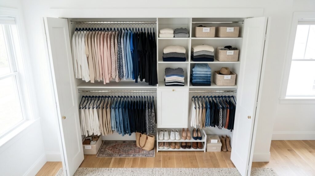
This comprehensive guide provides specific, measurable strategies that completely reinvent how you interact with your clothing daily. You will discover unique layout concepts that require zero construction skills or massive financial investments. Most of these practical styling layouts take less than three hours to implement fully on a standard weekend. I have intentionally included specific product recommendations from trusted brands like The Container Store and IKEA.
Many people mistakenly believe that strict color coordination requires an expensive professional stylist or a massive custom closet. I strongly disagree with this limiting belief based on my extensive background in residential space planning. We will tackle the exact steps needed to categorize your tricky patterned garments and bulky seasonal sweaters effortlessly. By the time you finish reading, you will possess the exact blueprint needed to execute a flawless visual transformation.
1. Rainbow Spectrum Arrangement
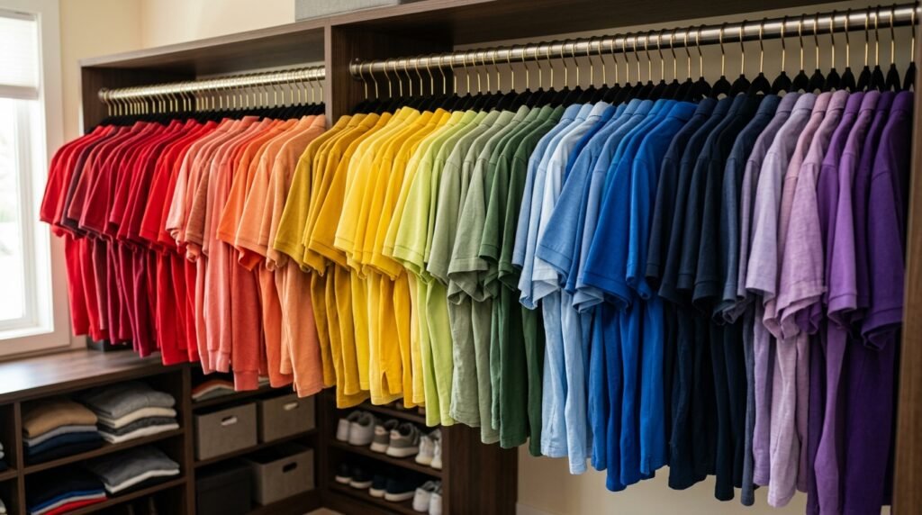
Visual thinkers absolutely thrive when they can instantly recognize familiar patterns within their daily personal spaces. Implementing a strict rainbow sequence provides the most intuitive structural foundation for your entire clothing collection. I always start my client projects by grouping items using the traditional red through purple progression. This classic method works incredibly well because our brains already recognize this specific sequence from nature. You drastically reduce cognitive load when your eyes naturally follow a predictable path to find a specific garment. This simple layout trick saves the average person roughly ten minutes of frustrating searching every single morning.
You must invest in uniform velvet hangers before attempting this vibrant rainbow transformation in your home. Mismatched plastic or thick wooden hangers create terrible visual clutter that ruins the beautiful color flow entirely. I highly recommend purchasing the slim velvet options from Amazon Basics or Neat Method for maximum space efficiency. These specific hangers prevent delicate silk blouses from slipping while maintaining a perfectly sharp shoulder line. A consistent hanger profile allows the actual fabric hues to become the primary focal point of the space. This small initial investment drastically elevates the overall sophisticated appearance of your newly arranged closet.
Maintaining this bright spectrum layout requires strict discipline when putting away your clean laundry each week. I have noticed that people often throw clean clothes back randomly when they feel rushed or extremely tired. You must consciously place that navy blue sweater directly between the bright blue and deep purple items consistently. Creating a simple color chart and taping it inside your closet door acts as a brilliant training tool. Over a few short weeks, this intentional placement process becomes a completely automatic and incredibly satisfying habit. Your beautifully arranged rainbow space will remain perfectly organized for many years.
2. Light to Dark Cascading
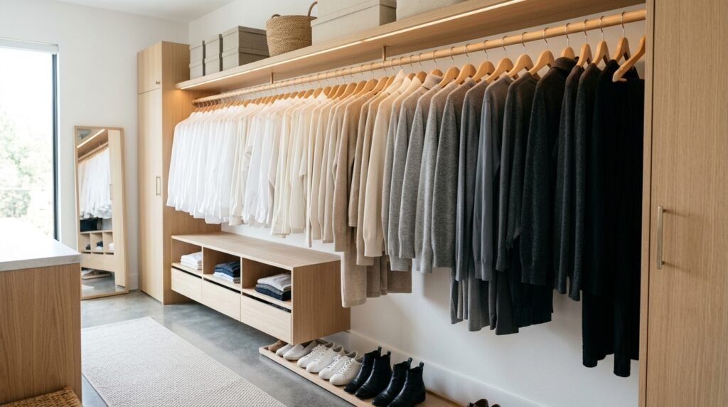
Creating a smooth visual cascade from bright whites down to deep charcoals creates instant architectural harmony. Many modern homes feature incredibly small reach-in closets that easily feel oppressive when filled with dark clothing. I have seen how starting with bright white items completely opens up a cramped residential space visually. The eye naturally moves from the lightest elements toward the heaviest, creating an illusion of expanded room depth. This specific gradient method perfectly supports professional individuals who primarily wear subtle corporate tones instead of bright neon colors. It brings an undeniable sense of calm sophistication to any tight bedroom environment.
Transitioning through your neutral garments requires careful attention to the subtle undertones hiding within the fabric. You will quickly discover that some gray shirts pull heavily toward blue while others lean distinctly brown. I suggest setting up a bright LED ring light inside your room while sorting these tricky neutral pieces. Proper illumination prevents you from accidentally placing a warm taupe sweater next to a cool silver blouse. Getting these subtle transitions wrong completely disrupts the smooth visual cascade you are working so hard to achieve. Taking your time during this specific step ensures a flawless and professional final result.
Maintaining the cascading layout relies heavily on organizing your clothing items by sleeve length within each hue. When you have five different light gray shirts, arrange them sequentially from sleeveless tanks to heavy winter sweaters. This brilliant secondary system prevents visual chaos and makes locating specific seasonal garments incredibly fast and effortless. I learned this exact technique while studying retail visual merchandising strategies used by high-end luxury clothing boutiques. They utilize this method to make their inventory look abundant yet meticulously controlled on the showroom floor. You can easily replicate this exact high-end boutique aesthetic inside your own home today.
Handling Neutral Tones
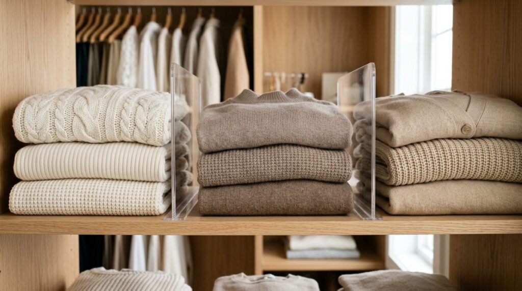
Organizing a massive collection of beige, cream, and taupe garments frustrates many highly visual people initially. These colors often blend together, creating a muddy appearance that completely lacks distinct visual boundaries and structure. I highly recommend inserting small physical dividers between your warm neutrals and your distinctly cool neutral items. Products like the clear acrylic shelf dividers from The Container Store work beautifully to separate these confusing categories. This subtle physical barrier trains your eye to recognize the specific temperature shifts between your various neutral garments. It brings necessary structure to the most visually ambiguous section of your entire collection.
You should always place your heavy textured knits separately from your smooth silk or cotton neutral pieces. A chunky cream cable knit sweater visually overpowers a delicate ivory silk camisole when hung directly adjacent. I always group my textured neutrals together to create a cohesive block of heavy materials that looks intentional. This textural separation adds incredible depth and interest to an otherwise monotonous section of pale clothing items. Visual thinkers appreciate this subtle layering because it creates beautiful shadows and highlights within the neutral color palette. Your closet instantly transforms into a highly curated and deeply satisfying sensory experience.
Pure White Separation

Keeping your pure white garments completely isolated from off-white and cream items is absolutely essential for visual clarity. When bright white cotton sits directly next to ivory silk, the ivory piece immediately looks dirty and heavily aged. I have rescued many perfectly good blouses from donation piles simply by moving them away from pure white items. You must create a dedicated section exclusively for those crisp, brilliantly white shirts that reflect maximum light brightly. This strict isolation ensures your favorite classic button-down shirts always look completely fresh, incredibly crisp, and highly professional. It protects the integrity of your lightest wardrobe pieces.
Storing pure white clothing requires specialized care to prevent ugly yellowing and permanent dust line damage over time. I strongly advise against using any cheap plastic dry cleaning bags because they trap moisture and ruin delicate fibers. Instead, protect your seasonal white garments using breathable cotton garment bags from reputable brands like neatfreak or ClosetMaid. You should also ensure your pure white section sits far away from open windows that invite harsh, fading sunlight. Implementing these strict preventative measures keeps your brightest garments looking absolutely pristine for many consecutive years. Your visually stunning closet demands this specific level of protective care.
3. Monochromatic Capsule Sections
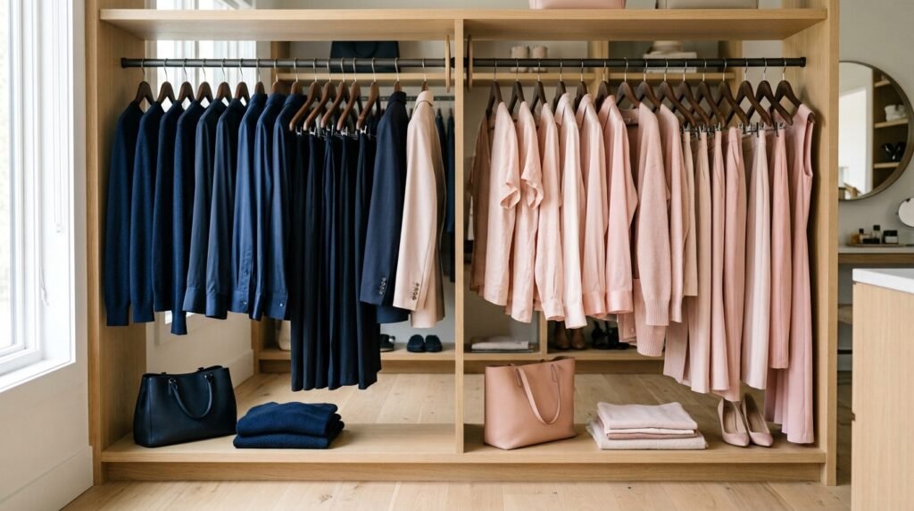
Designing small monochromatic capsules within your broader collection works perfectly for busy professionals who travel frequently. Instead of blending everything together, you create dedicated zones featuring only navy blue or solely blush pink items. I have implemented this highly strategic method for clients who absolutely despise thinking about matching outfits early mornings. You simply walk to your designated olive green section and grab pants, a shirt, and a jacket simultaneously. This completely removes the risk of clashing patterns or wearing mismatched tones when you feel incredibly rushed. It provides the ultimate streamlined approach for people wanting effortless daily elegance.
Building these distinct color pods requires you to assess your current inventory with ruthless honesty and brutal clarity. You might suddenly realize you own fourteen black shirts but absolutely zero black pants to complete an outfit. I always use the capsule creation process to identify massive gaps in my clients’ daily wearing habits instantly. When you isolate colors into individual blocks, your purchasing mistakes become undeniably obvious and impossible to ignore further. This visual confrontation ultimately saves you thousands of dollars by preventing redundant future shopping trips for identical items. You naturally start buying missing pieces that actually complete your existing capsules.
Spacing between your monochromatic zones drastically improves the overall visual impact of this specific organizational strategy perfectly. You must leave at least two inches of empty rod space between your navy capsule and your gray capsule. I achieve this clean separation by using simple wooden closet rod dividers clearly labeled with the specific hue. This intentional negative space allows your brain to process each distinct clothing group without feeling completely visually overwhelmed. It mimics the incredibly calming aesthetic found in expensive minimalist art galleries and high-end luxury retail environments. Your bedroom instantly feels far more expensive and deeply intentional.
4. Pattern and Print Buffers
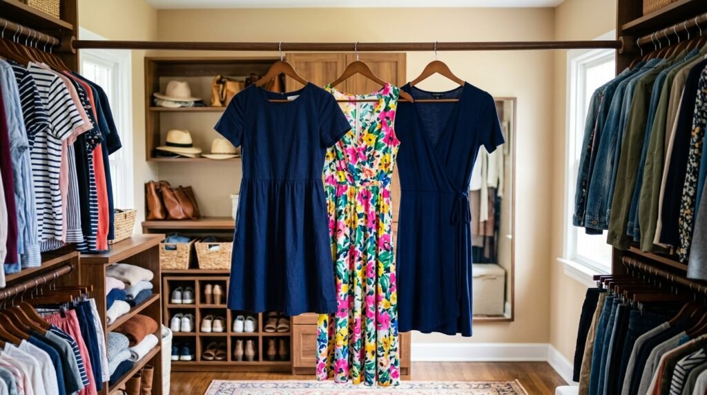
Managing loud floral prints and aggressive geometric patterns ruins many well-intentioned wardrobe organization color projects entirely. When you place multiple complex patterns directly next to each other, the visual vibration causes extreme eye strain. I have seen highly sensitive visual thinkers completely abandon their newly organized spaces because the patterns felt overwhelming. You must actively use your solid-colored garments as visual buffers between your heavily patterned shirts and flowing dresses. Placing a solid navy blue dress between two completely different floral prints immediately calms the chaotic visual energy. This strategic spacing technique restores peaceful harmony to your vibrant clothing collection.
Categorizing your prints correctly requires you to identify the dominant background hue of every single patterned garment individually. A floral shirt featuring tiny pink roses on a massive solid black background fundamentally belongs with your dark clothing. I always teach clients to squint their eyes slightly while looking at a highly complex printed silk blouse. The specific color that remains most visible through blurred vision dictates exactly where that item belongs right now. This simple trick eliminates the paralyzing confusion people feel when trying to categorize heavily multicolored summer clothing. You can confidently place every single item using this reliable method.
Sometimes you own wildly chaotic items that simply defy all logical categorization and refuse to blend in smoothly. These eccentric statement pieces require their own dedicated exclusion zone located at the far edge of your rack. I affectionately call this the wildcard section, and it acts as a designated space for completely unique artistic garments. Pushing these visually demanding items to the perimeter prevents them from aggressively interrupting your beautifully smooth color transitions. Visual thinkers absolutely need this strict boundary to maintain the structural integrity of their primary daily wardrobe. It embraces your bold style while preserving overall structural harmony completely.
5. Category First Color Second
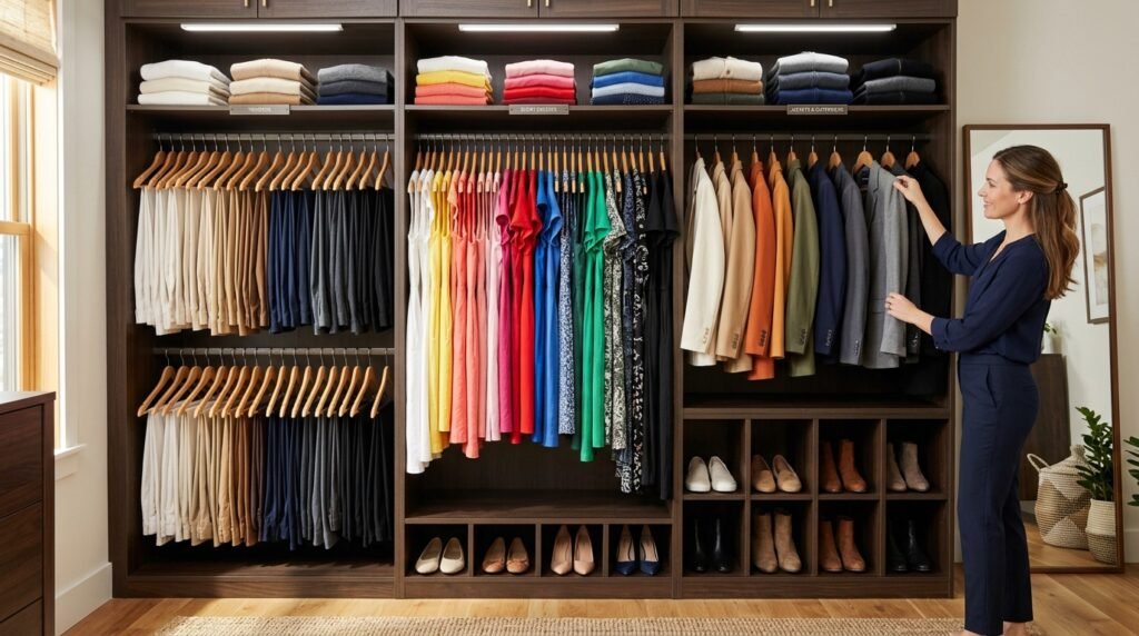
Organizing strictly by hue without considering the actual garment type completely destroys daily functionality for most active adults. You absolutely cannot place a bulky red winter coat next to a delicate red summer swimming cover-up seamlessly. I strongly advocate dividing your space into massive structural categories first, such as long dresses, trousers, and tailored jackets. Once you establish these rigid physical boundaries, you then apply your beautiful spectrum sequence strictly within each category. This dual-layered system perfectly bridges the gap between stunning visual aesthetics and highly practical daily usability requirements. It ensures you find the exact item you genuinely need quickly.
Separating your casual weekend wear from your strict corporate attire represents a crucial step in this specific method. Your brain naturally associates different clothing categories with completely different mental states, energy levels, and upcoming daily responsibilities. I have noticed that mixing a relaxed Sunday hoodie with a Monday morning blazer creates subtle psychological friction. By creating two completely distinct zones, you protect your relaxing weekend mindset from stressful corporate visual reminders completely. Applying a gradient sequence independently to your casual wear and your workwear delivers absolutely flawless visual satisfaction daily. You get the aesthetic beauty without sacrificing essential lifestyle boundaries.
Hanging your pants by color requires a slightly different physical approach than arranging your lightweight cotton button-down shirts. I heavily prefer folding trousers over sturdy wooden hangers rather than clipping them vertically by their delicate waistbands. When you fold pants uniformly and arrange them from light khaki to deep charcoal, you create a solid block. This heavy visual foundation anchors the lower half of your closet, making the space feel architecturally grounded and secure. It prevents the incredibly messy, jagged hemline appearance that completely ruins most amateur closet transformation attempts. Your space will look remarkably structured, balanced, and professionally finished.
6. Seasonal Palette Segregation
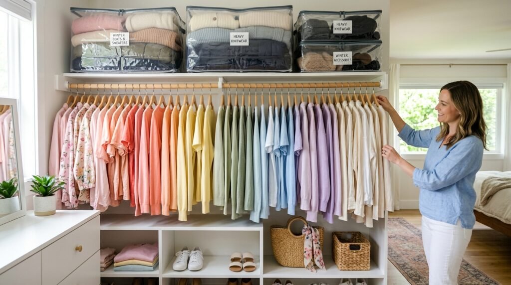
Forcing pastel spring dresses to sit alongside heavy burgundy winter sweaters creates jarring and uncomfortable visual contradictions instantly. Highly sensitive visual thinkers find this specific seasonal clash incredibly distracting when trying to get dressed every morning. I constantly encourage clients to aggressively rotate their inventory based strictly on the current weather and local outdoor temperature. You should only display the specific color palettes that logically correspond with the current season occurring outside today. Packing away your deep autumnal rusts and heavy forest greens during sunny July makes your space feel appropriately light. This seasonal rotation completely refreshes your visual environment quarterly.
Storing your off-season clothing properly protects your expensive investments while freeing up massive amounts of valuable daily space. I highly rely on the airtight vacuum storage bags from Spacesaver to compress gigantic winter coats incredibly flat. You must clearly label these plastic bins with bright typography so you can quickly identify your hidden color palettes. Sliding these heavily compressed containers under your bed or onto high shelves removes immense visual weight from your bedroom. When autumn finally arrives, unpacking those rich mustard and deep plum garments feels like an exciting new shopping spree. It completely reignites your passion for your clothes.
Transitioning between seasons smoothly requires a flexible temporary zone dedicated exclusively to highly unpredictable transitional weather patterns daily. During early spring, you realistically need access to both bright floral skirts and moderately warm camel-colored cardigans simultaneously. I suggest utilizing a freestanding rolling rack from IKEA to hold these specific transitional pieces for three short weeks. This keeps your primary closet perfectly color-coded while allowing highly functional access to necessary layering pieces without disrupting harmony. Once the weather finally stabilizes completely, you pack the remaining off-season items away and restore perfect order. It brilliantly solves the most frustrating wardrobe maintenance challenge entirely.
Winter Heavy Knits
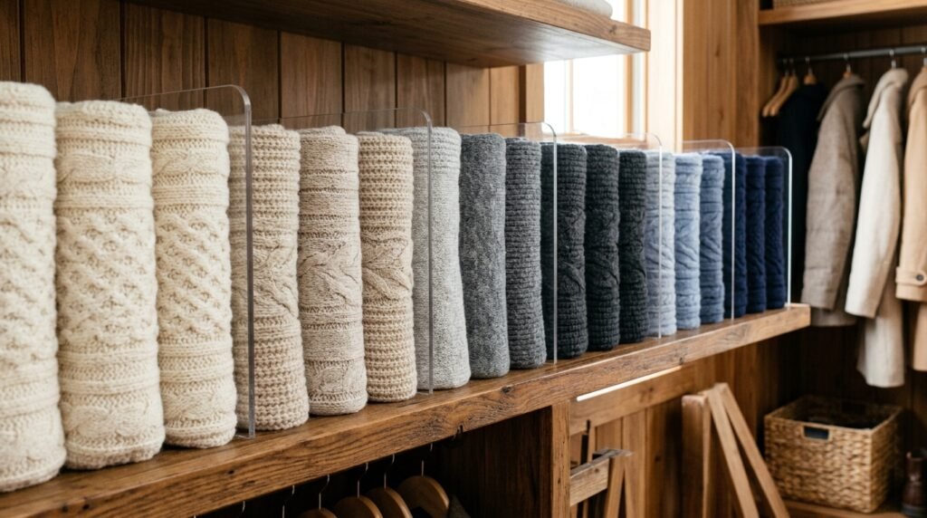
Storing massive winter sweaters on thin hangers completely ruins their delicate structural integrity and stretches the shoulder seams permanently. You must strictly fold your heavy knits and arrange them on solid wooden shelving directly above your hanging garments. I have found that organizing folded sweaters by shade creates a stunning visual display resembling an expensive boutique window. You stack your soft cream cashmere at the top, transitioning down through your rich navies and deep charcoal wools. This specific vertical color blocking technique maximizes vertical storage space while maintaining absolute visual brilliance beautifully. It treats your most expensive garments with profound respect.
Maintaining perfectly neat folded sweater stacks requires specialized acrylic shelf dividers to prevent inevitable leaning and eventual collapsing entirely. Without these rigid physical barriers, your beautiful gradient quickly degrades into a completely chaotic, tangled mess of expensive wool. I always install clear dividers from Elfa every twelve inches across the entire length of the upper closet shelving. This strict physical boundary forces you to fold your garments to a highly specific and uniform width every single time. The transparent acrylic material remains completely invisible, allowing your beautiful spectrum of winter textiles to shine brightly. It guarantees lasting structural perfection easily.
7. Accessory Hue Matching
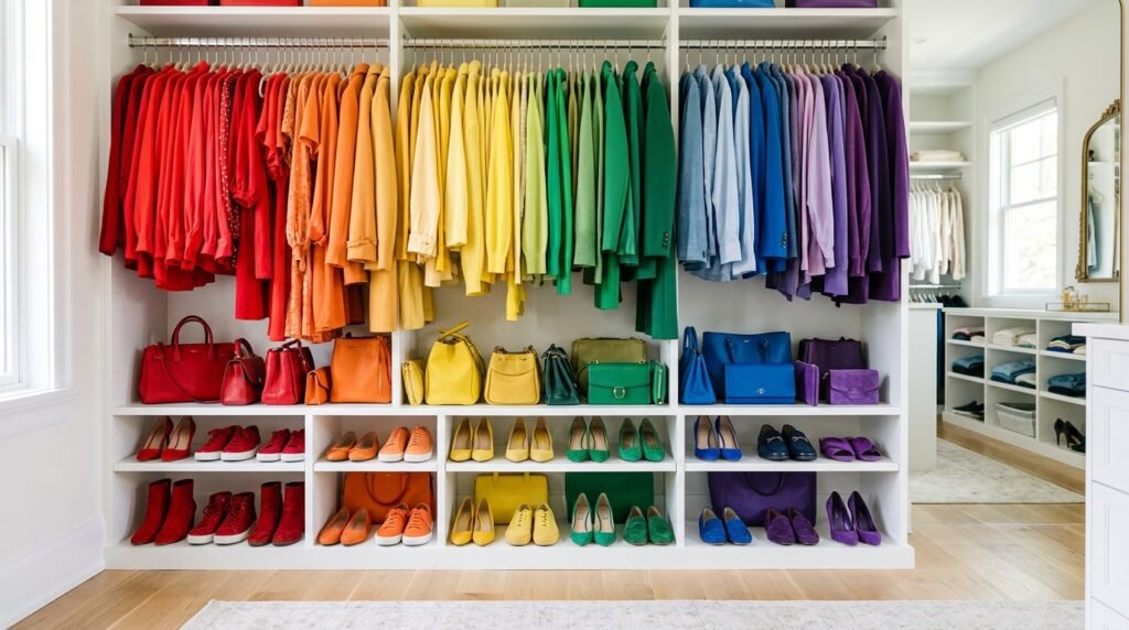
Ignoring your massive collection of shoes, handbags, and scarves completely undermines your newly established colorful clothing arrangement entirely. Visual thinkers absolutely need every single element within the designated space to participate in the overarching structural logic flawlessly. I always insist that clients arrange their footwear using the exact same gradient sequence applied to their hanging garments. When your bright red flats align perfectly directly below your bright red blouses, the visual impact becomes absolutely staggering. This strict vertical alignment creates an incredibly satisfying sense of complete environmental control and profound artistic harmony. It ties the entire room together effortlessly today.
Displaying your colorful handbags correctly transforms a basic storage area into a highly curated and stunning personal gallery space. You absolutely cannot stuff beautiful leather purses inside dark canvas bins where their vibrant hues remain completely hidden forever. I highly recommend using individual clear acrylic display boxes to protect expensive leather while proudly showcasing the brilliant dyes. Arranging these transparent boxes on a top shelf creates a striking architectural feature that instantly draws the eye upward. It honors your financial investment while actively contributing to the overarching aesthetic brilliance of your newly organized room. Your accessories finally get the spotlight.
Managing chaotic silk scarves and heavy winter pashminas requires a highly specialized hanging tool to maintain strict visual order. Tossing them randomly into a deep dresser drawer completely destroys their accessibility and hides their beautiful intricate printed patterns. I utilize velvet-coated accessory rings connected to a single sturdy hanger to neatly display up to a dozen scarves. You simply thread your yellow scarves through the first ring, moving down toward the dark greens and heavy blues. This compact vertical display system utilizes almost zero lateral rod space while perfectly echoing your primary layout. It elegantly solves a massive organizational headache immediately.
8. Gradient Transition Grouping
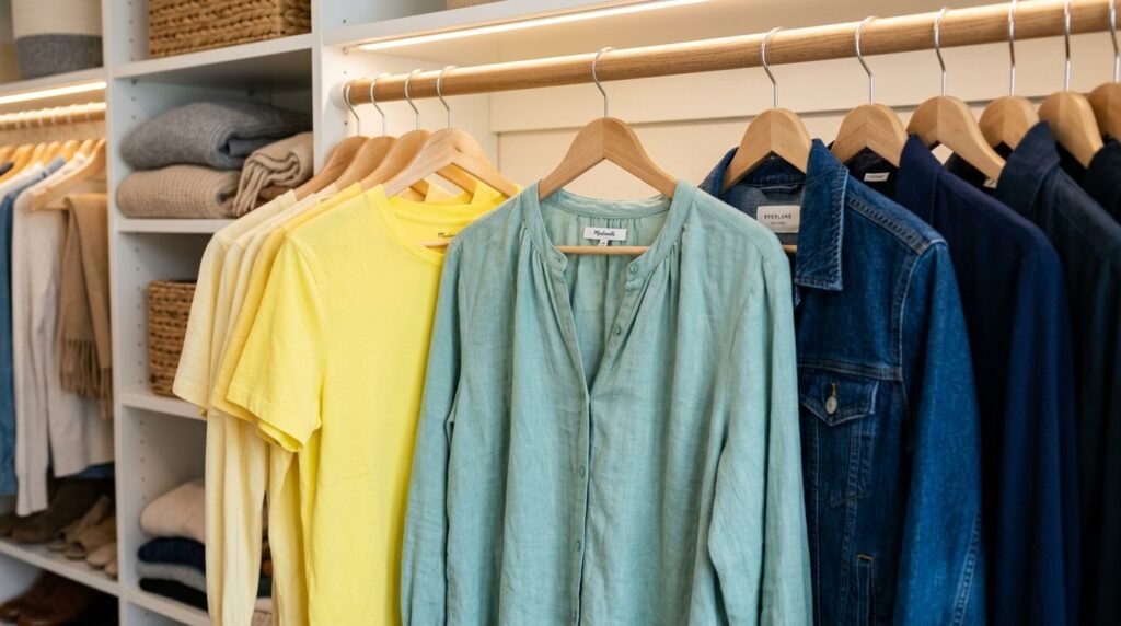
Mastering the delicate art of gradient transition completely elevates a basic organizational attempt into a truly professional aesthetic masterpiece. You cannot simply jump violently from a bright sunny yellow directly into a deep navy blue without causing visual whiplash. I have seen how introducing a soft seafoam green perfectly bridges the harsh gap between warm and cool tones successfully. These subtle transitional garments act as critical visual connective tissue, tying your wildly different fashion choices together beautifully. It requires incredible patience to analyze every single shirt and determine its exact rightful place within the gradient. The stunning final result completely justifies the effort.
Managing garments that feature large blocks of two completely different colors challenges even the most experienced visual organizational experts. A bold dress featuring equal halves of bright pink and solid black defies all standard logical placement rules completely. I always recommend placing these dramatic two-tone garments exactly at the physical intersection of those two specific color zones. If your pink section sits directly beside your black section, that dual-colored dress acts as the perfect literal bridge. This incredibly clever placement technique turns a highly frustrating categorization problem into a brilliant display of advanced styling logic. It proves your absolute mastery of spatial design.
Maintaining a flawless gradient heavily depends on standardizing your ambient bedroom lighting to reflect colors accurately and consistently daily. Cheap yellow incandescent light bulbs completely distort blue fabrics, making them appear incredibly muddy and aggressively unappealing every evening. I always insist clients install high-quality daylight LED bulbs featuring a color rendering index completely above ninety percent immediately. True daylight illumination allows you to distinguish between a cool charcoal gray and a warm brownish taupe without any struggle. This simple hardware upgrade completely transforms how you perceive and interact with your personal clothing collection daily. Perfect lighting makes your gradient sing vibrantly.
9. Black Wardrobe Integration
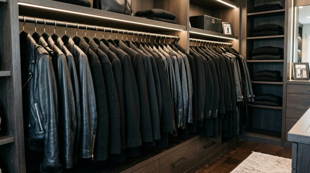
Executing a flawless black wardrobe organization strategy proves incredibly challenging because dark fabrics aggressively absorb all available ambient light. Visual thinkers often struggle with massive blocks of black clothing because they lack distinct shadows, highlights, and clear boundaries. I have noticed that people simply cannot differentiate their black silk blouses from their black cotton t-shirts in dim lighting. You must introduce subtle textural variations to break up the dense, oppressive void created by dozens of dark garments. Alternating smooth leather jackets between heavy wool coats provides the necessary visual relief your tired eyes desperately crave. This simple textural trick saves your sanity.
Placing your massive collection of black clothing requires highly strategic positioning within your overall bedroom layout to prevent heaviness. If you place a gigantic block of black coats immediately inside the doorway, the entire room feels incredibly claustrophobic instantly. I always position the darkest garments at the deepest, furthest point of the closet to create forced visual perspective. This strategic placement naturally draws the eye inward, making a tiny reach-in space feel significantly deeper and substantially wider. It prevents your heavy dark clothing from visually dominating and physically suffocating your brightly lit, carefully curated bedroom environment. Lightness must always prevail upfront.
Maintaining deep black fabrics requires aggressive lint management and strict separation from any garments that shed fuzzy white fibers. A stunning black velvet blazer looks completely ruined when placed directly next to a shedding white angora wool sweater. I strongly recommend utilizing black velvet hangers exclusively for your dark section to prevent any contrasting visual dust lines. You must also keep a high-quality sticky lint roller permanently mounted on the wall directly beside your dark garments. These strict preventative measures ensure your darkest, most sophisticated clothing always looks incredibly sharp, highly professional, and perfectly flawless daily. True elegance requires this meticulous attention.
Frequently Asked Questions
How do I organize multicolored patterned shirts efficiently? To effectively categorize wildly multicolored items, you must immediately identify the single dominant background color hiding behind the busy print. I highly recommend squinting your eyes slightly until the intricate pattern blurs, revealing the primary foundational hue of the garment. Once you identify that a floral shirt leans predominantly navy, place it securely within your dark blue section without hesitation. This brilliant visual trick completely eliminates the overwhelming paralysis most people feel when sorting heavily printed summer clothing. You can rapidly organize complex pieces using this incredibly reliable and highly tested visual identification strategy successfully every single time.
Should I group clothes by color or by category first? You absolutely must establish strong physical categories first before applying any strict color sequence to your daily clothing collection entirely. Hanging a heavy winter coat next to a delicate summer tank top simply because both are red creates massive functional chaos. I always tell clients to rigidly separate their pants, skirts, short-sleeve shirts, and heavy jackets into entirely distinct physical zones. Once these highly logical boundaries exist, you can beautifully arrange the garments from light to dark within each specific grouping. This essential dual-layer system guarantees perfect visual harmony without sacrificing essential daily usability and functional speed.
What hangers work best for a colorful closet? Achieving a truly flawless and highly professional aesthetic heavily depends on utilizing identically matched, ultra-slim velvet hangers throughout your entire space. Mismatched chunky plastic or thick wooden hangers create terrible visual noise that completely ruins your beautiful gradient transitions instantly. I consistently recommend purchasing black or light gray velvet hangers from trusted brands like Amazon Basics to ensure complete uniformity. These specific hangers possess incredible grip, preventing your delicate silk blouses from constantly slipping off and wrinkling on the dirty floor. A unified hanger profile allows the vibrant fabric colors to completely dominate your visual field beautifully.
How do I handle a closet with mostly black clothes? Mastering black wardrobe organization requires you to heavily prioritize subtle textural differences since you lack bright hues for visual separation. When staring at fifty black garments, your eyes cannot easily distinguish a crisp cotton shirt from a soft cashmere sweater. I always advise alternating your smooth silk pieces with your heavy textured knits to create essential visual boundaries between items. You should also position this massive dark block at the absolute back of your closet to prevent it from absorbing all ambient light. Proper textural spacing guarantees your dark collection looks incredibly sophisticated rather than completely overwhelming.
Does organizing by color actually save time daily? Implementing a logical spectrum layout completely eliminates the exhausting cognitive fatigue associated with blindly searching for specific daily garments every morning. Visual thinkers process this colorful spatial information almost instantly, allowing their brains to pinpoint a blue shirt without conscious effort. I have witnessed numerous frustrated clients reduce their stressful morning dressing routine by roughly fifteen minutes using this method. When your items logically flow from light to dark, your eyes naturally glide to the exact correct zone immediately. This massive reduction in daily decision fatigue provides an incredibly peaceful and highly productive start to your busy day.
How much does a full closet transformation cost? Executing a stunning visual transformation requires a surprisingly minimal financial investment if you rely heavily on strict spatial logic. Purchasing a comprehensive set of premium velvet hangers represents your primary expense, generally costing around fifty dollars for one hundred pieces. I also recommend acquiring clear acrylic shelf dividers from The Container Store, which might add another forty dollars to your total budget. You absolutely do not need to hire expensive contractors or install incredibly costly custom wooden shelving to achieve perfection. With roughly one hundred dollars and a free Saturday, you can entirely revolutionize your daily environment.
Where should I put my white and cream clothing? You must violently separate your brilliantly pure white garments from your slightly yellowish cream or ivory pieces to prevent visual degradation. When stark white cotton touches a warm ivory silk blouse, the beautiful ivory piece instantly looks incredibly dirty and severely aged. I strongly suggest placing a completely different color, like light gray or pale pink, directly between your whites and your creams. This strict physical buffer zone protects the delicate visual integrity of both specific neutral color categories perfectly. It ensures your crisp white shirts always look spectacularly fresh, brilliantly clean, and highly professional every day.
What if I share a closet with my partner? Sharing a tight space requires you to establish an aggressive physical boundary directly down the exact center of the entire closet. You absolutely cannot intermingle your bright colorful garments with your partner’s collection of dark corporate suits without causing massive visual chaos. I highly recommend installing a rigid vertical wooden divider or hanging a distinct visual marker to completely separate the two zones. Once completely separated, you can apply the beautiful rainbow gradient method exclusively to your designated personal side entirely. This respectful boundary allows you to enjoy flawless visual harmony without disrupting your partner’s preferred daily systems.
How do I maintain the color system after doing laundry? Maintaining your beautiful layout requires highly aggressive personal discipline whenever you put away your freshly laundered clothing batches each weekend. You cannot lazily toss a green shirt onto the nearest empty hanger and expect your stunning gradient to survive the busy week. I heavily suggest taping a small printed color chart directly inside your cabinet door to serve as a strict visual reminder. Over a few short weeks, intentionally placing garments back into their exact correct hue zone becomes an incredibly satisfying, completely automatic habit. Consistent repetition absolutely guarantees your space remains spectacularly organized for many consecutive years.
Should I use this method for my workout clothes? Applying a strict gradient sequence to your messy athletic wear drastically improves your motivation to actually exercise early in the morning. Workout clothing often features incredibly loud neon colors that look completely chaotic when stuffed randomly inside a deep dresser drawer. I prefer hanging expensive athletic leggings and bright moisture-wicking shirts precisely from bright yellow down to deep black. This highly structured visual display makes your brightly colored gym gear look like an expensive, highly curated luxury athletic boutique. You will naturally feel incredibly energized and genuinely excited to grab a perfectly matched outfit before your intense workout.
How do I store massive winter coats by color? Organizing gigantic winter coats requires immense spatial awareness because their heavy bulk easily destroys the delicate visual balance of your room. You must cluster all massive outerwear completely separately from your thin daily shirts to prevent a terribly jagged, chaotic hemline appearance. I always arrange heavy wool coats and puffy jackets in their own dedicated zone, moving slowly from light camel down to black. If your space feels incredibly cramped, I strongly advise vacuum-sealing off-season coats in plastic bags and hiding them away entirely. This preserves your essential daily space while maintaining the strict overarching visual aesthetic perfectly.
What type of lighting works best for seeing colors clearly? Installing completely accurate lighting represents the most critical hardware upgrade for anyone attempting to color-code their entire wardrobe successfully today. Cheap yellow incandescent bulbs completely distort delicate fabrics, making a beautiful navy blue shirt look incredibly similar to a faded black one. I absolutely insist that clients purchase premium daylight LED bulbs featuring a color rendering index completely above ninety-five percent immediately. This brilliant, crisp white illumination mimics natural sunlight, allowing your eyes to easily distinguish between highly confusing dark shades effortlessly. Superior lighting completely ensures your beautiful gradient transitions remain spectacular and perfectly accurate regardless of the hour.
Your Next Step Toward Visual Harmony
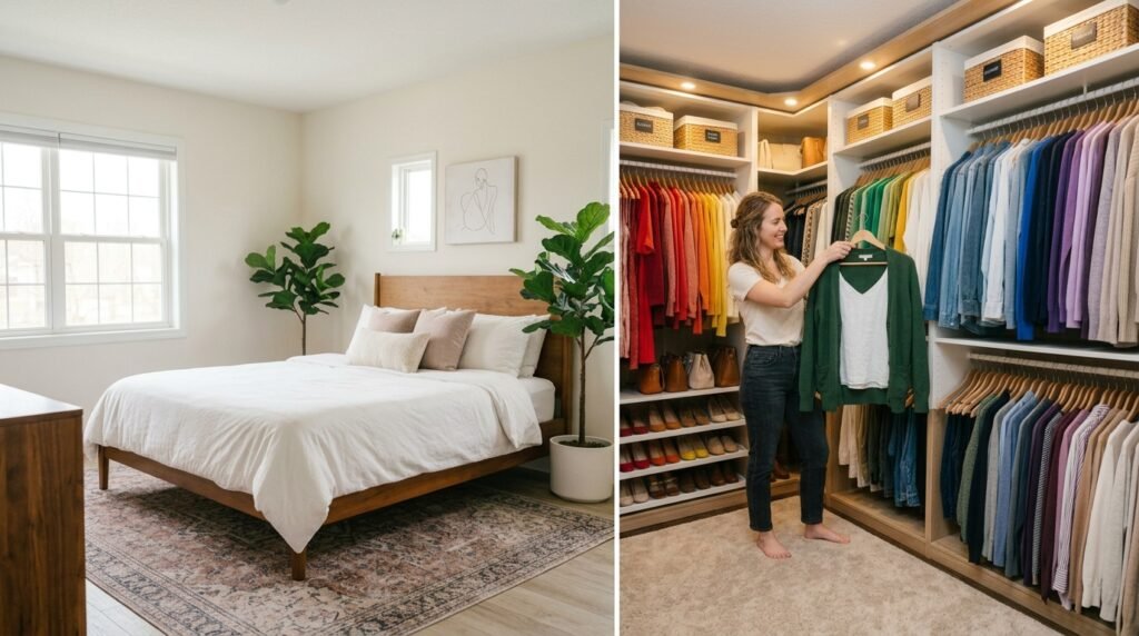
Creating a stunningly arranged space fundamentally changes how you interact with your environment every single morning. When you fully implement these strategic methods, your daily dressing routine transforms from a stressful chore into a profoundly peaceful ritual. I have seen how small changes like these can completely transform a space into a highly functional personal sanctuary. Remember to maintain strict discipline with your new wardrobe organization by color system during laundry days. Please save this extensive guide to your favorite Pinterest inspiration boards right now. Try applying just one of these brilliant layout concepts to your messy closet this weekend!

Amelia leads HavenlyStyle’s editorial vision with a passion for elegant interiors and practical home living. With years of experience in home décor and lifestyle content, she ensures every article is accurate, inspiring, and easy to follow. From timeless decorating ideas to the latest interior design trends, Amelia is committed to helping readers create beautiful, functional spaces while maintaining HavenlyStyle’s trusted and welcoming voice.